An upcycled Edwardian home
A chance meeting in the pub led designer John Sutcliffe and his musician wife, Gabrielle, to the Edwardian home in which they now live.
‘We wanted to downsize from our former four-storey property, and we knew the person who lived here, so we agreed that he would move to the bungalow of his dreams and we would buy his house.’
One of the key attractions for the Sutcliffes was that very little had been done to the house since the Sixties. ‘It was typical of its date: it had a front room with a bay window, a dining room behind, and then a back area with a kitchen, larder, scullery and downstairs cloakroom.
Upstairs, there was a big front bedroom, two smaller bedrooms and a bathroom,’ explains John, adding that the layout was familiar because, by a strange quirk of fate, when they first moved to Cambridge three decades earlier, they lived in the house on the other side of the party wall.
It took two years of renovations to transform the new house into the home we see today. Making the most of the available space downstairs was a top priority.
‘We did what I rather disapprove of,’ says John. ‘We ripped the place apart.’ Lifestyles have changed, he explains: ‘We don’t live with a maid who will come and knock on the parlour door and say, “Supper’s ready, Sir”.’
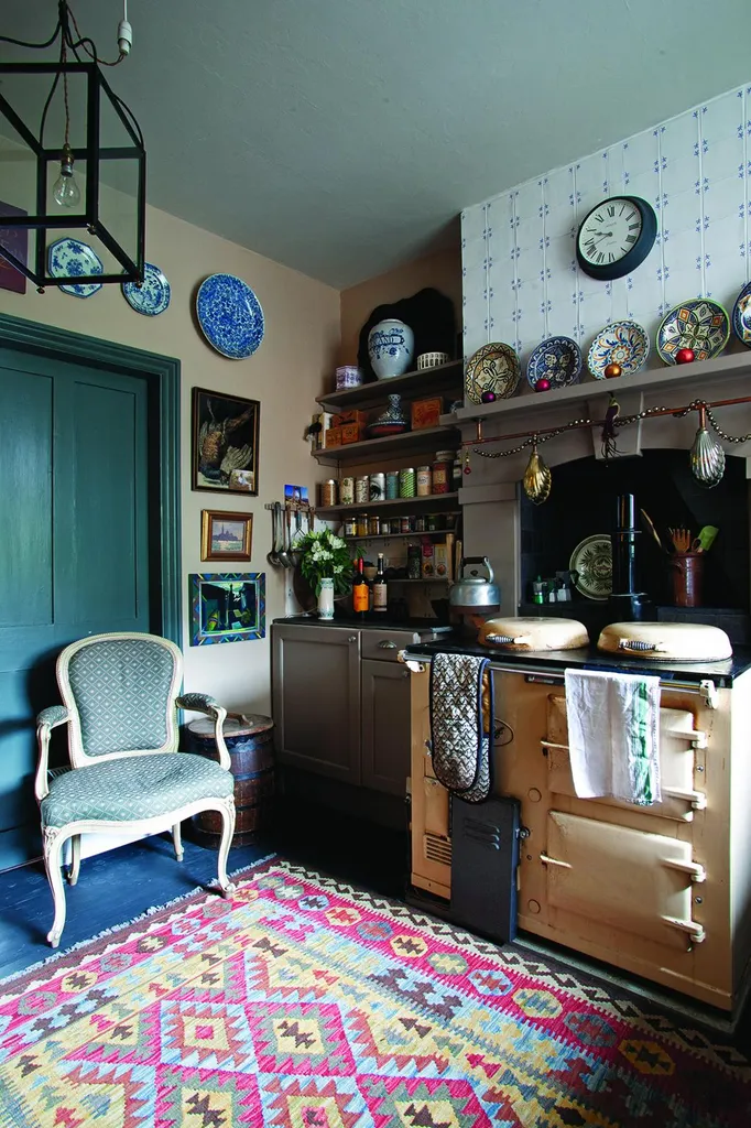
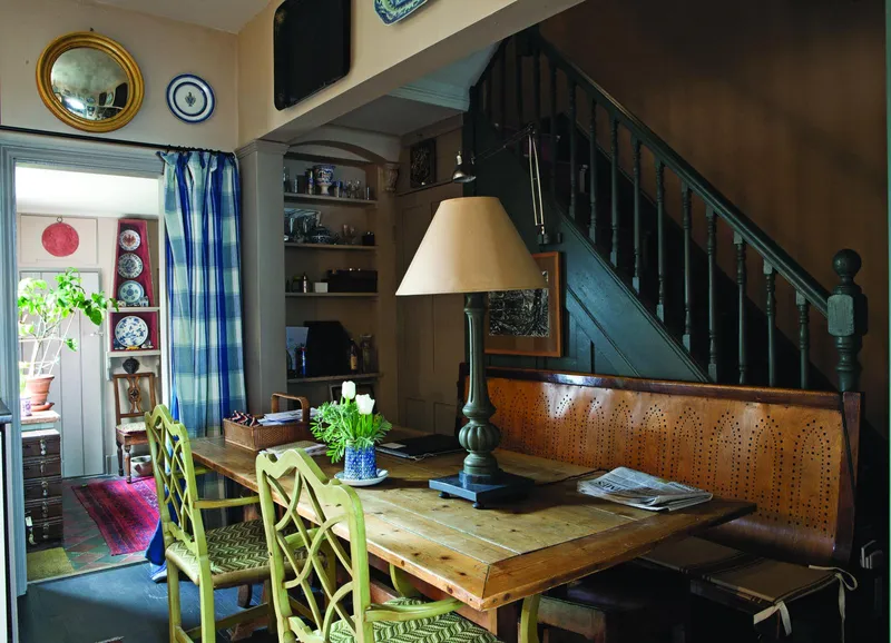
And so they removed the corridor that ran the length of the house, along the party wall, opening up the rooms across the width of the house. Taking out the huge chimney breast that originally housed the range in the kitchen also made a huge difference, and the bricks this produced were used in the garden.
When the major restructuring was done, the couple turned their attention to smaller details. John thought the internal doors with high lock rails were aesthetically unappealing.
Turning them upside down seemed an obvious solution, but that in turn led to another visual anomaly because the bottom rail (now at the top) looked too wide and unwieldy. ‘So we cut a channel in it to lighten and make sense of it.’
Keen upcyclers, the couple found uses for all the timber and bricks that they removed. ‘It is a recycled house, and we also bought lots of bits in local auctions and from reclamation yards.’
The door leading to the garden is typical of their inventive use of old materials. ‘It’s a door from a reclamation yard near Cambridge. We cut out the top panels and inserted the coloured glass panel which we also bought locally.’
Old furniture was also cleverly reused. In the downstairs cloakroom, the ‘thunderbox’ lavatory was made from an old Victorian dining table.
A Regency eagle crested mirror in the kitchen is a confection made by John, ‘with an eagle that had dropped off something I found in a local auction’, an old frame from John’s childhood home, and a convex shop fitting mirror glass, ‘one of those ones to stop shop lifting’, he says.
You might also like a colourful Edwardian home inspired by Florence
If no suitable old materials are available, John happily employs new. A bookcase in the stone hall was designed to hold magazines and is made from mdf painted black, decorated with mouldings cut from the sheets of print-room ornaments he created for the National Trust in the 1970s and then varnished.
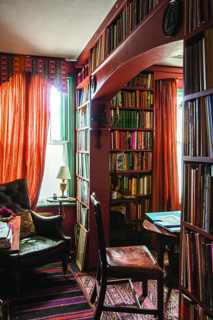
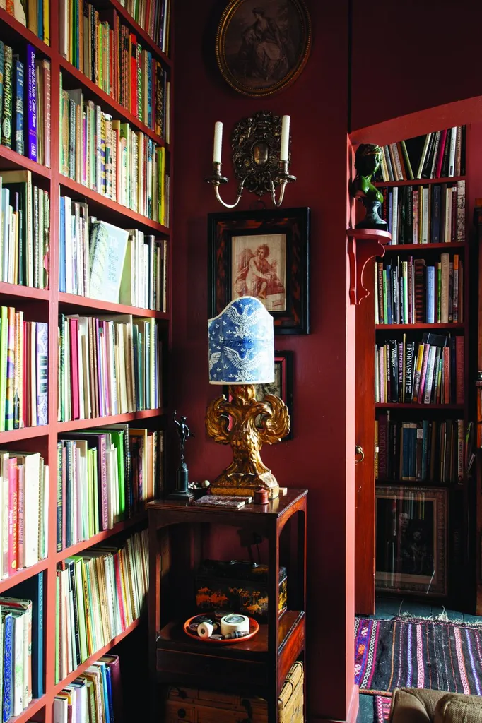
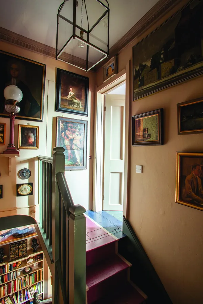
When they started to think about the decoration of their Edwardian house, inspiration came from Sir John Soane’s Museum. ‘I wasn’t trying to rip it all off, but we have lots of pictures and objects and we like to see them. One of the good things about moving is that when you rehang pictures and rearrange your possessions they are new again,’ says John.
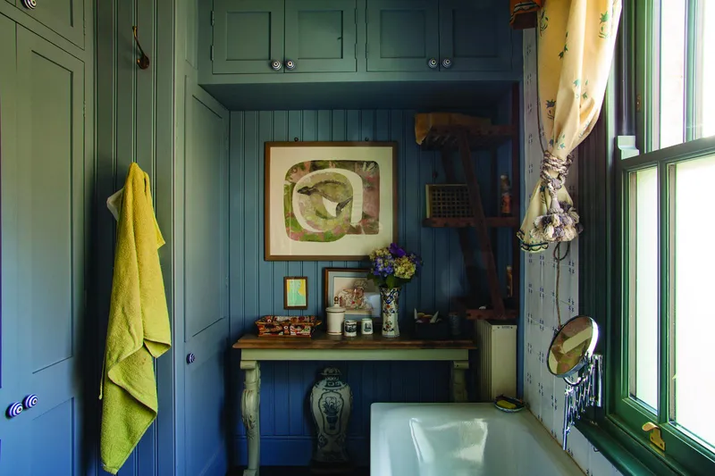
Having worked as a colour designer with Farrow & Ball in its early years, John has a keen eye for the nuances of tone, so it’s no surprise that the backdrop for his newly displayed collections are carefully chosen. ‘All the paints we’ve used are samples that I mixed up and took to B&Q to make in large quantities.’
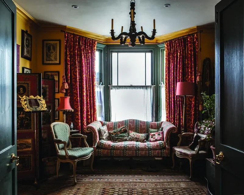
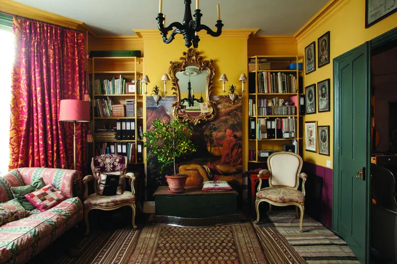
The kitchen, stone hall, stairs and passage are all painted in a pale stone colour with darker skirtings, while both the outside and inside of the windows in the music room, front and back door are a shade of bronze green that John based on a colour he remembered seeing in the Soane Museum.
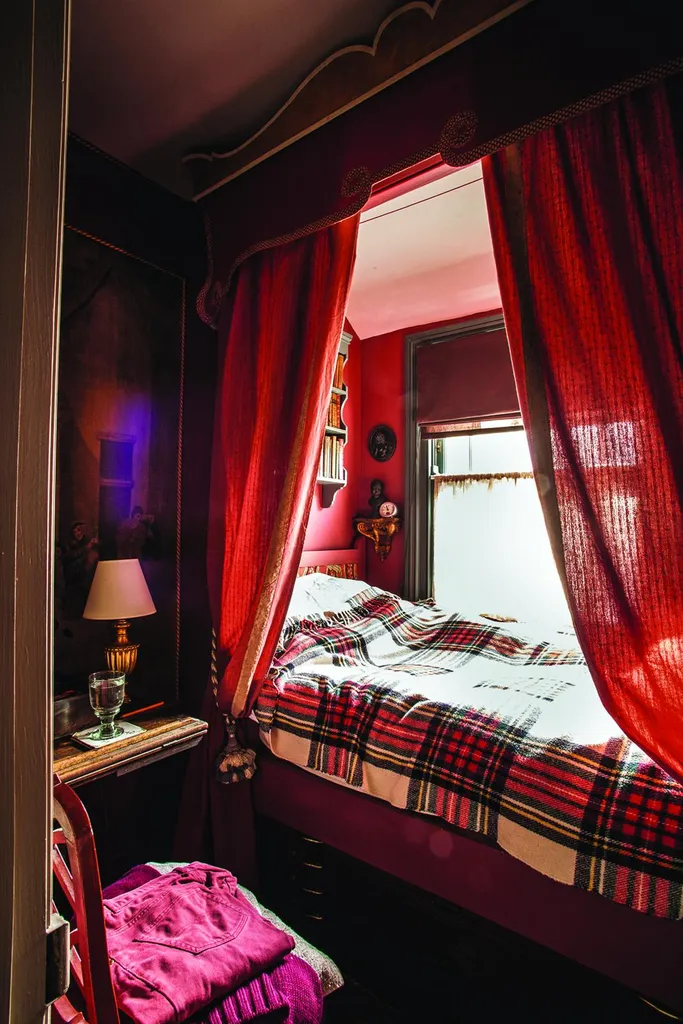
Meanwhile, the stairs leading up to the bedroom are painted in a trompe l’oeil effect to resemble a red and blue carpet. Elsewhere in the house, colours were chosen with the art that would be displayed on them very much in mind.
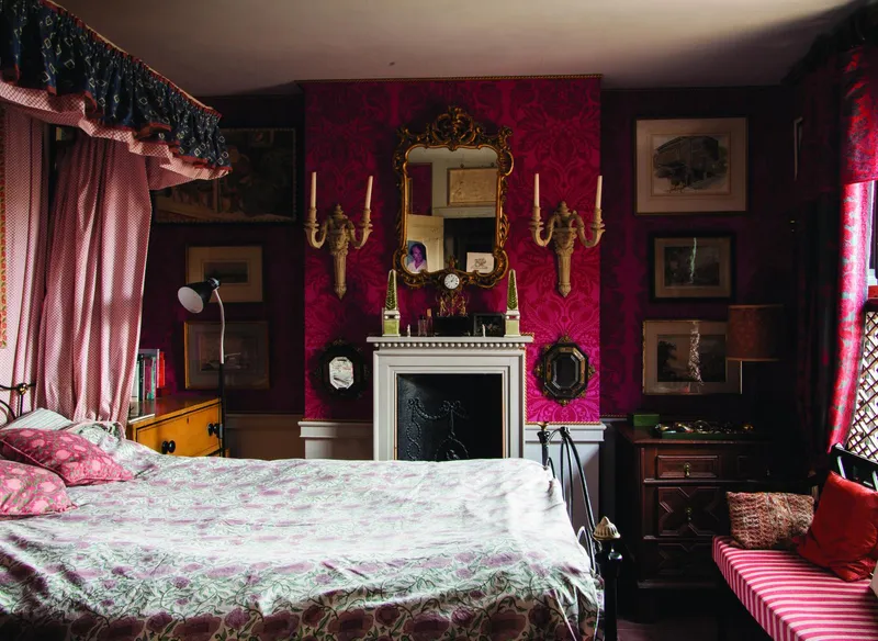
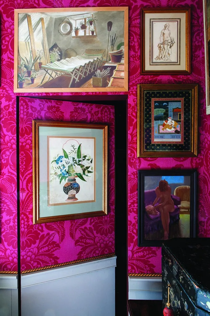
‘Black and white prints look good on yellow, so that’s what we have in the music room, whereas a red background is better for coloured paintings,’ explains John. In the main bedroom, the walls are hung with a crimson damask-print wallpaper that Gabrielle found heavily discounted online. ‘It’s not Colefax and Fowler at £120 per roll – it’s B&Q at a fraction of that, but it shows off the pictures just as well.’
One of John’s favourite paintings, which hangs in the couple’s bedroom, is a striking flower picture. ‘It looks as though it’s an 18th-century Chinese painting,’ he says.
‘But, actually, it’s a copy I made after one in a house where we were staying in Italy. My mother-in-law was convinced that I’d substituted my version for the original, but I didn’t. This is mine!’
More homes from Homes & Antiques
- A vibrant, colourful Edwardian home
- An opulent Edwardian home filled with antiques and original features
- Josh Widdicombe & Rose Hanson's colourful Victorian home
- A Dutch home filled with bold colours and eclectic antique
Sign up to our weekly newsletter to enjoy more H&A content delivered to your inbox.
