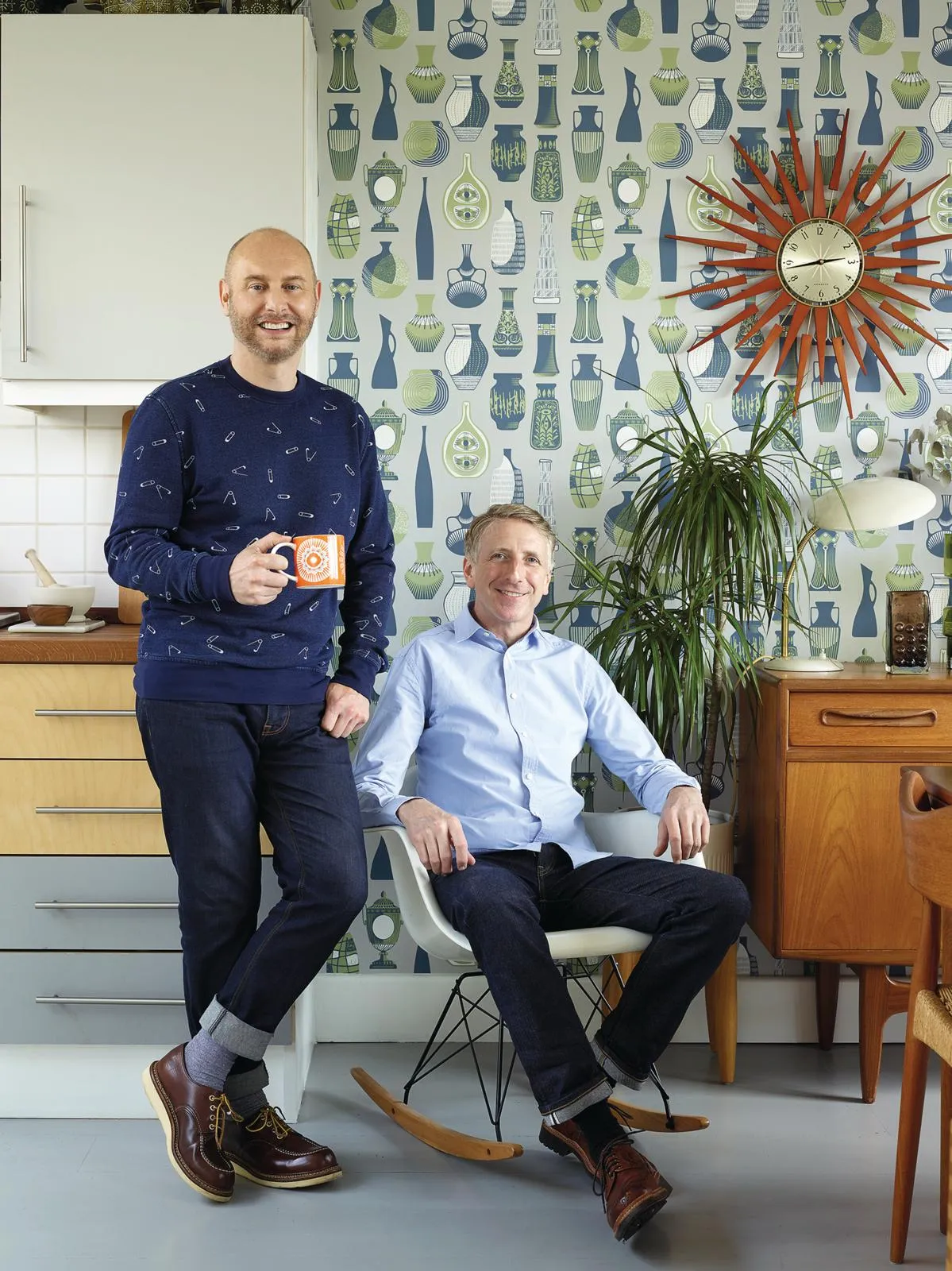
Growing up in Yorkshire in the mid-1980s Mark Hampshire and Keith Stephenson led parallel lives. ‘We never met as teenagers but we did all the same things. We watched 1960s films and went to junk shops. Our pocket money was spent on retro wire fruit bowls and painterly, mid-century curtains, which we’d turn into shirts for Saturday nights out,’ reminisces Keith.
Their paths crossed in 1997 when they landed jobs in the same design agency where they bonded over 20th-century design. They have been together ever since, in life and business, as co-founders of the vintage homewares brand Mini Moderns.
Life and work also converge in their south London home. In a perfect world, say the chatty duo, this would be a mid-century townhouse. ‘We’d always imagined ourselves living on a 1960s estate with a shared garden and garage for the Mini,’ says Keith. But modernist homes are a rarity in Britain, so they settled for this contemporary townhouse instead.
Tucked behind a Victorian terrace, on the site of a former print factory, the three-storey property is set in a pioneering development of 15 ‘live-work’ houses designed for the creative businesses – photographers, artists, designers – who give the mews its communal feel. Downstairs, there is a lofty double-height studio; a separate entrance leads to the living space above.
You might also like a modern home in the Cotswolds filled with art and antiques
Upstairs, 1960s crooner Burt Bacharach drifts from the speakers and light streams in through the wide windows. ‘When we moved in this was a featureless, magnolia box with horrible surfaces. So we decided to eradicate the worst bits and give it a 60s townhouse vibe,’ says Mark. The threadbare carpet was replaced with wooden floors painted grey for linoleum effect. Neither are purists (the fitted wardrobes are from Ikea) but almost all the furnishings here have provenance.
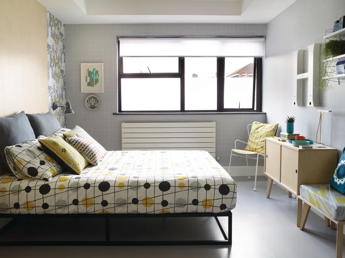
In the bedroom, George Nelson’s 1948 Bubble pendant glows next to a chair designed by Ernest Race for the Festival of Britain in 1951. Inspired by another idol, Gio Ponti, they also designed the floating ply bedside tables and tall headboard, which adds to the streamlined feel.
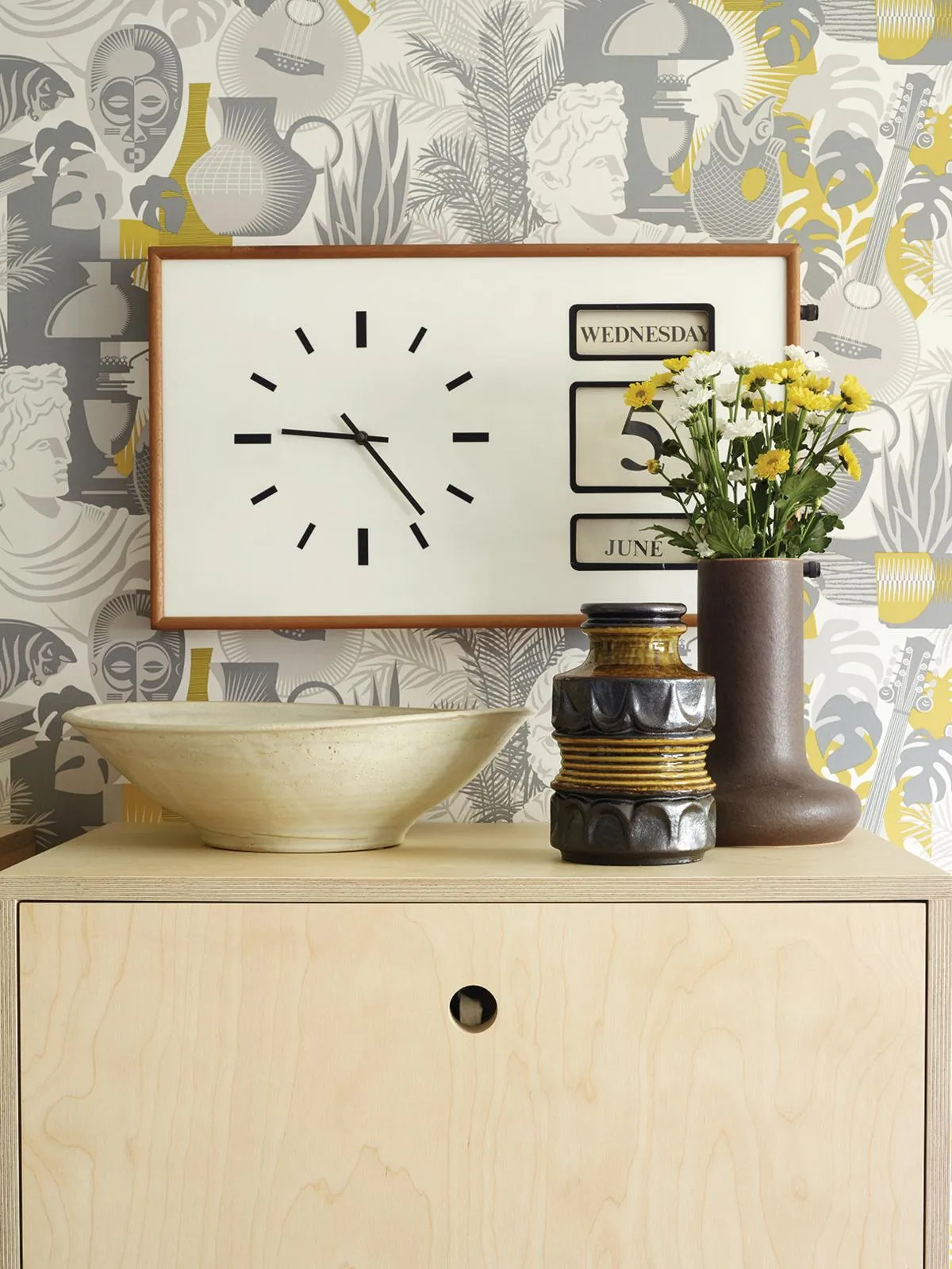
Gradually the house has become a testing ground for their designs featuring graphic prints with that optimistic post-war appeal. In the spare room, the walls are lined with samples of their best-selling wallpapers, which also feature in their book, Mid-Century Modern Living – a witty, personal round up of their favourite mid-century designers and influences. Keith points out Whitby: bright with stylised blue and white waves, it’s a tribute to childhood summer holidays on the Yorkshire coast.
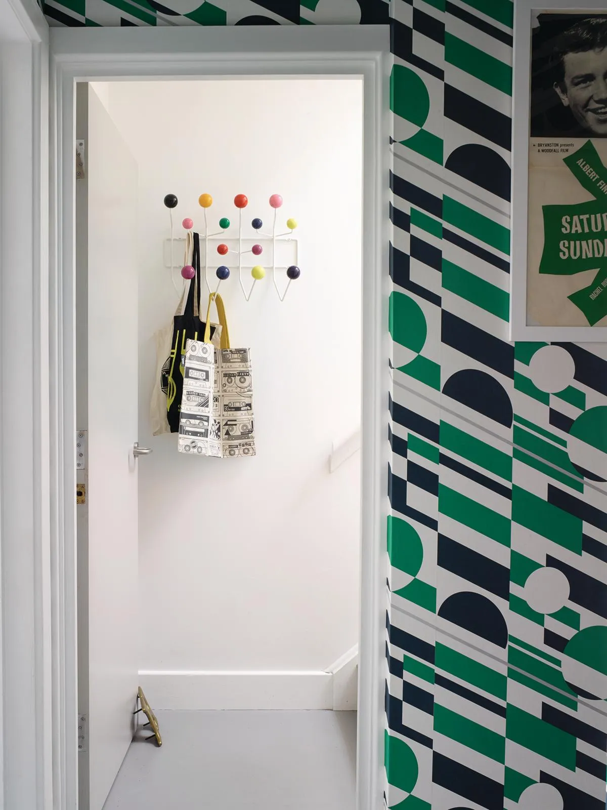
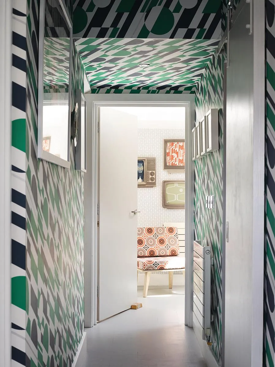
Art Room, adorned with an oil lamp and African mask, captures sixth form still-life classes. In the hallway, graphic P.L.U.T.O paper (inspired by an underwater pipe line and dazzle camouflage painted on war ships) clambers over walls and ceiling, adding to the feel that you have tumbled into an Op Art painting.
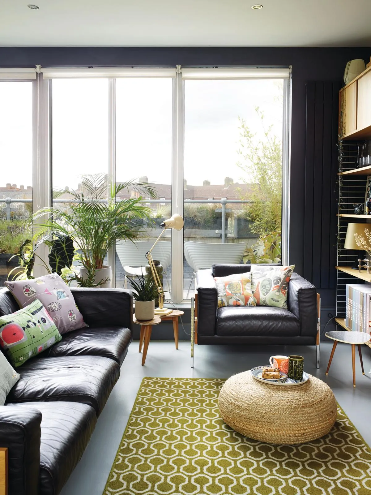
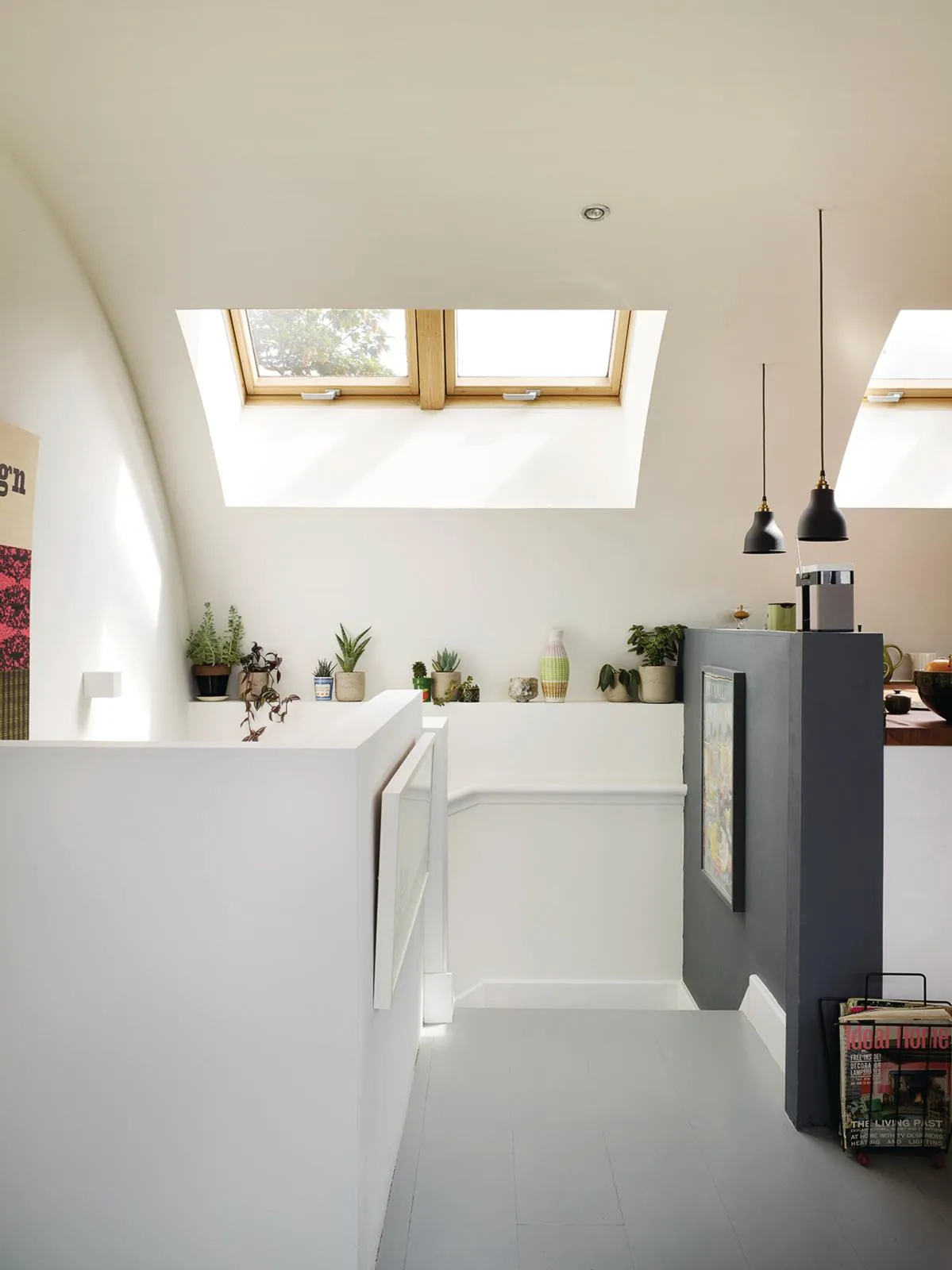
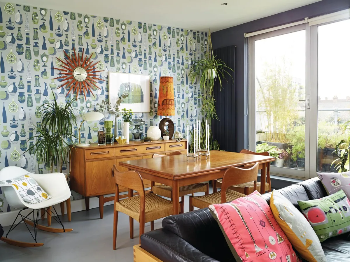
Wallpaper also brings colour to the staircase, which rises to the top floor. As in that yearned-for 60s house, this is the main living area. The kitchen-dining area and sitting room flow towards the long terrace. New doors, in a mix of plywood and paint, transformed the developer kitchen into their design ideal.
You might also like a mid-century design home filled with fine art and antiques
‘Frank Guille’s 1958 kitchen for the British manufacturer Kandya to be precise,’ says Mark. The G-Plan sideboard belonged to Keith’s mum, the 1970s Trimphone still rings, ‘very loudly’ and the compact Danish dining table, bought at Dulwich’s Midcentury Modern Show, flips open to seat eight: ‘another example of good design’.
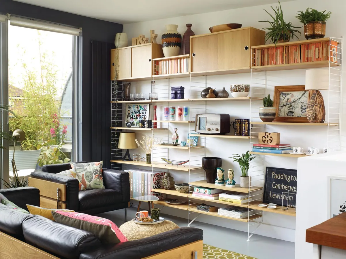
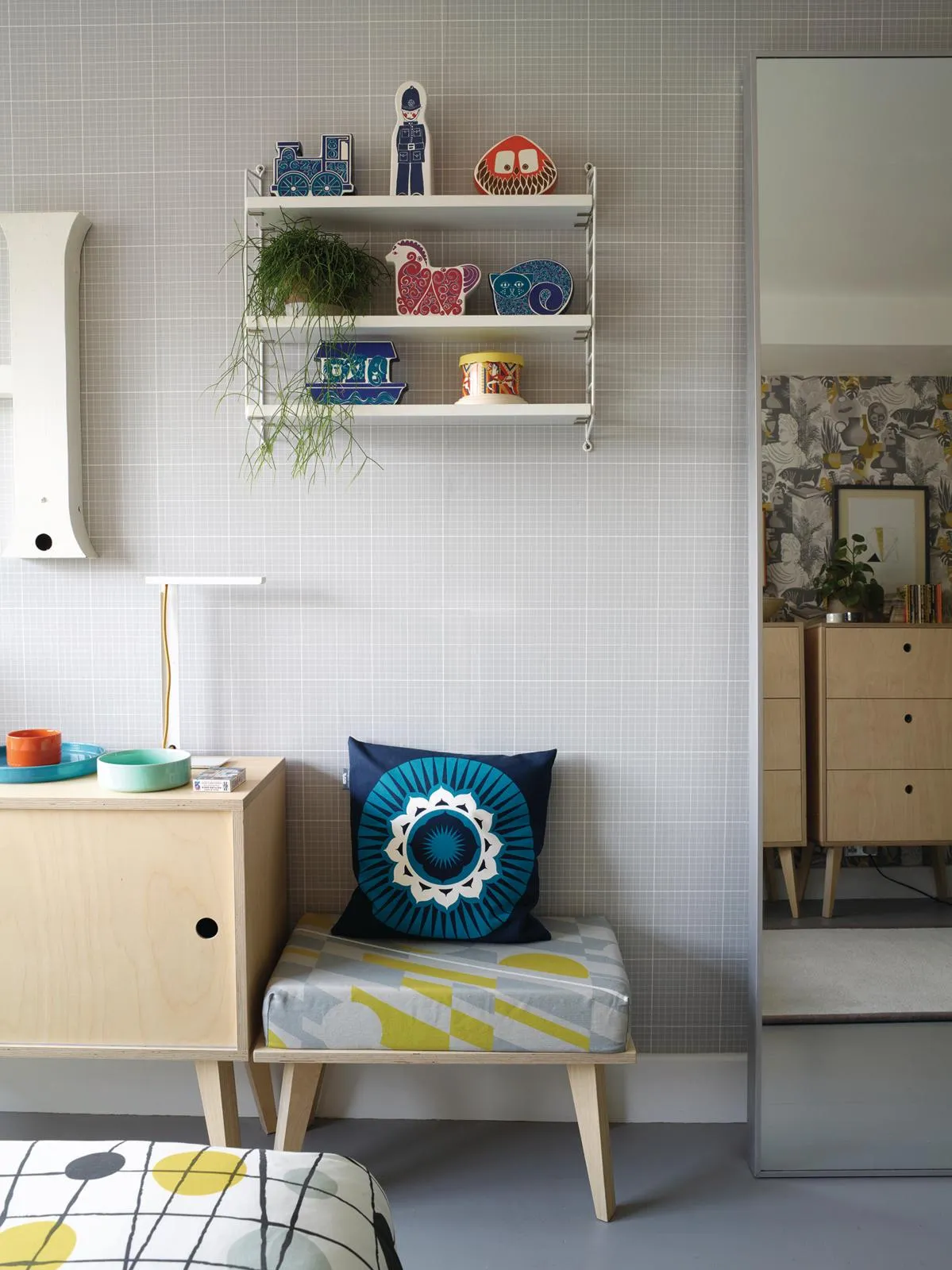
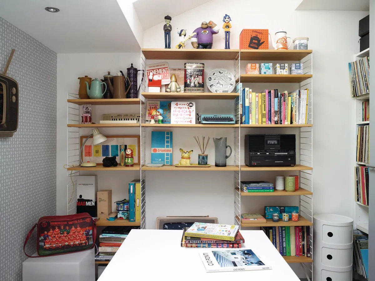
That teenage compulsion to rummage through market stalls for overlooked gems has never left them. Pocket-money finds – Susie Cooper cups and orange-spined Penguins – have been joined by more sophisticated purchases. There’s a set of 1970s West German studio pottery and sculptural crockery designed by Susan Williams-Ellis for Portmeirion in the 1960s, and folkish wooden dolls by the architect and designer Alexander Girard, ‘another hero of ours.’
Elsewhere, there’s a display of prized tumblers, made as commemorative souvenirs for the New York World’s Fair of 1964, ‘a showcase for mid-century architecture and design: the last hurrah for the American dream before the Civil Rights Movement and the Vietnam War,’ says Mark. ‘Each one is a piece of social history.’
Their favourite items though, are displayed on the String shelving, which has travelled with them from previous, rented homes. ‘The system was designed in 1949 by husband and wife team Nils and Kajsa Strinning for a publisher that was looking for an affordable, easy way to display books,’ says Keith. ‘It’s never been out of production since, which is just the kind of anecdote we like.’
More homes from Homes & Antiques
- An 18th-century Dutch townhouse with mid-century design
- A Victorian home filled with Seventies design
- A London home filled with mid-century furniture
- A 17th-century palace renovation
Sign up to ourweekly newsletterto enjoy more H&A content delivered to your inbox.
