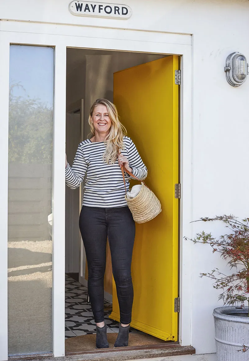
Stepping through the sunshine-yellow front door of Phil and Kelly’s bungalow, with its sleek screed floors, elegant mid-century furniture and largely monochrome colour scheme, it’s hard to imagine that not so long ago it was nothing more than a tiny, dilapidated, one-bedroom property. It is known variously by the neighbours as ‘The Californian house’ or ‘The house with funny windows’. Either way, it is an unexpected slice of the American West Coast amongst Cheltenham’s Regency terraces.
The previous owner had lived in the bungalow since it was built in the 1930s and, by the time the couple went to view it, the house had suffered years of neglect. ‘The floorboards were so damp they bowed when we walked on them,’ recalls Kelly, adding that the ceilings were also black with damp and dry rot.
Despite these very obvious problems, the couple could see its potential. ‘We fell in love with the sense of openness,’ says Kelly. ‘It didn’t matter to us that it was in such a poor state – we wanted a place where we could start from scratch.’
For Kelly, an experienced interior designer, it was a wonderful opportunity to work for herself. ‘I found it liberating,’ she says. ‘Compared to working with clients, I put a lot less thought into my own house – I could just go with what felt right.’ Phil, who is a photographer, also has a keen eye for design, which was a real bonus. ‘Luckily, we have similar taste and share a passion for interiors, so all the decisions were completely 50/50,’ he says.
You might also like Sue Timney's monochrome Georgian home
The plan from the outset was to create a relaxed and flexible living space. The couple began by demolishing everything apart from three exterior walls, which left them free to reshape the space to suit their needs.
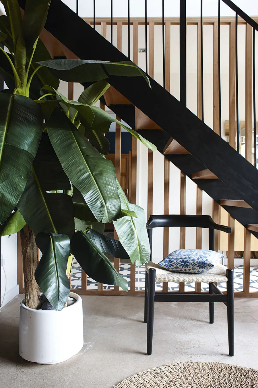
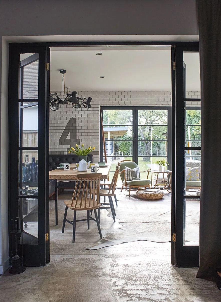
Rotten floorboards were replaced with screed, an experimental alternative to polished concrete, which gave them the industrial look they wanted at half the cost. To maximise the sense of space in the new extension, they designed an open-plan living area comprising dining room, living room and kitchen, with glass doors that open onto the garden. Kelly had additional glazing bars added to mimic Crittall windows that are so characteristic of 1930s architecture; in summer these are thrown open and the connection between the house and the garden feels seamless.
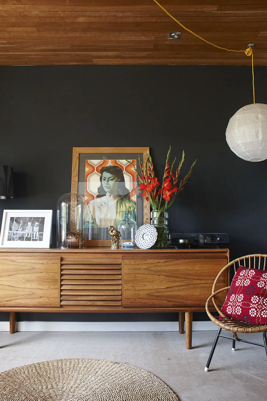
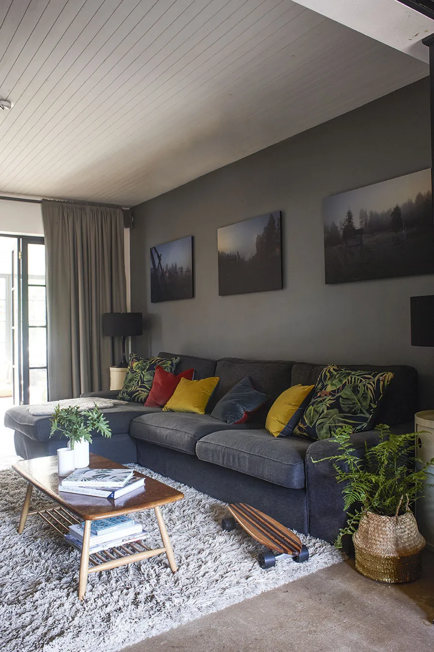
Once the bones of the place had been established, the couple threw themselves into decorating. ‘We designed the scheme around our favourite furniture,’ explains Kelly. The cherry wood panelling on the ceiling of the front reception room, for example, was chosen not only for its classic mid-century associations, but also because it echoes the warm tones of their favourite 1960s walnut sideboard.
‘We love interiors that have evolved over time,’ says Kelly. ‘Places that are furnished with a mix of old and new things, pieces that have history and a story to tell.’ The couple started collecting mid-century designs 18 years ago, when they bought their first house. ‘The designs are so timeless and simple,’ says Kelly, ‘and we love the scale of the furniture and the use of dark wood.’
You might also like a Victorian home filled with vintage industrial pieces
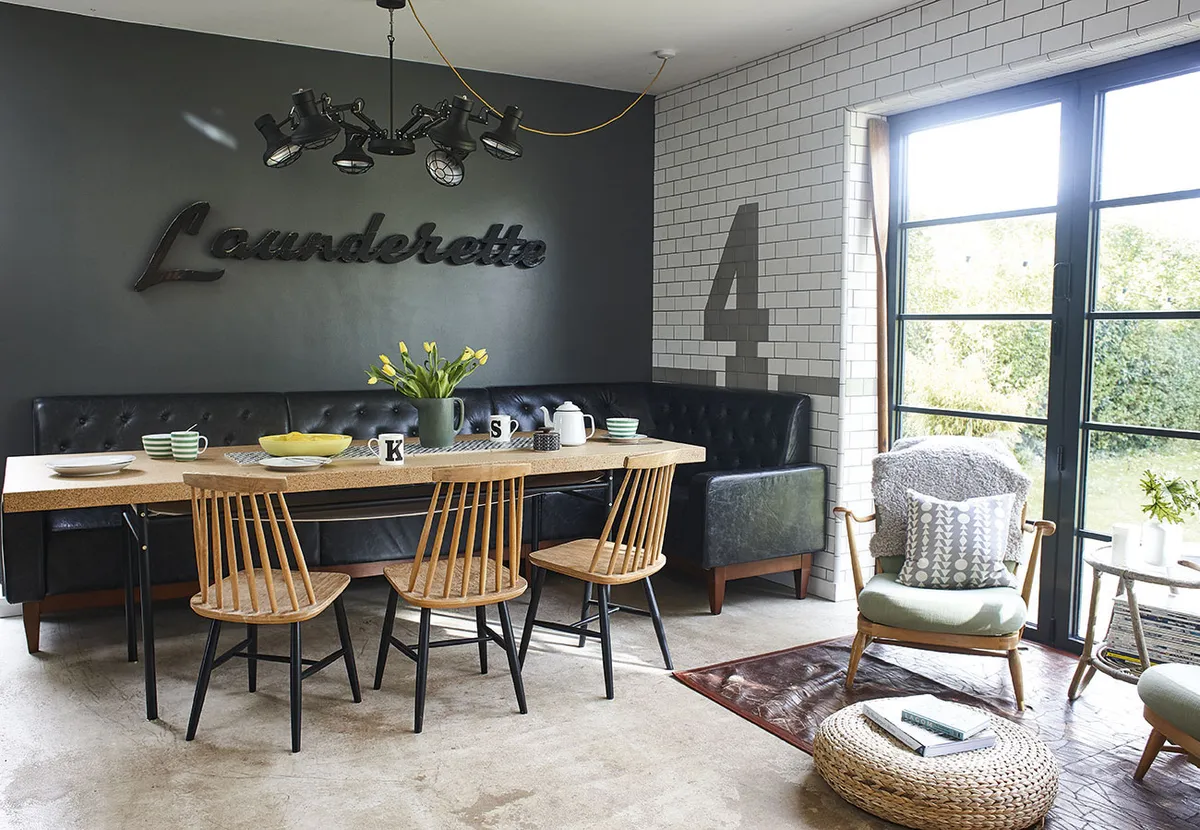
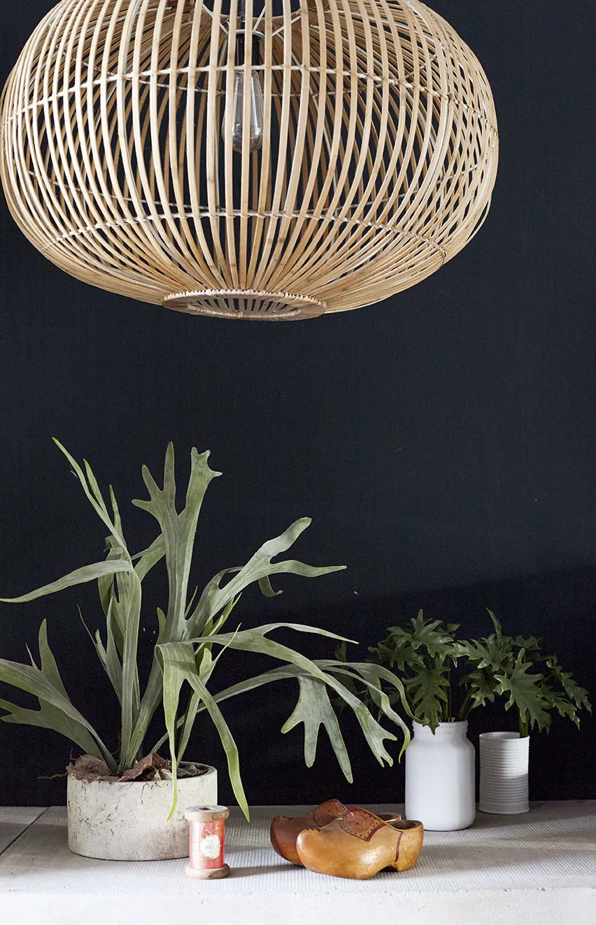
Although an avid collector, Kelly was determined to create a streamlined clutter-free space. ‘Working in the interiors industry, looking at pattern and colour all day, I wanted to come home to a minimal space where I could unwind.’ To that end she opted for a subdued palette of dark neutrals, including almost black walls. Visual interest comes in the form of key pieces of mid-century furniture, such as the Ercol chairs, vintage signage and classic pieces of kitsch art, such as the print of Tretchikoff’s Miss Wong.
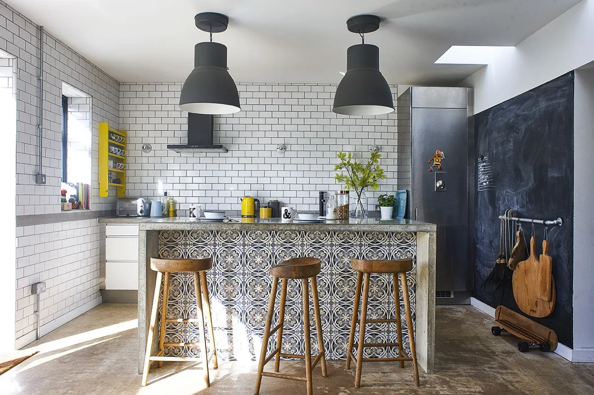
In the kitchen/dining area Kelly, whose clients include restaurants and coffee shops, decided to create diner-style banquette seating along two walls in order to keep the space as streamlined as possible. Similarly, any mess and clutter in the working area of the kitchen is hidden from view by a sleek concrete island, the front of which is decorated with Victorian-style tiles, which soften the industrial vibe. The overall look is reminiscent of an American diner – cheerful and practical rather than stark and clinical.
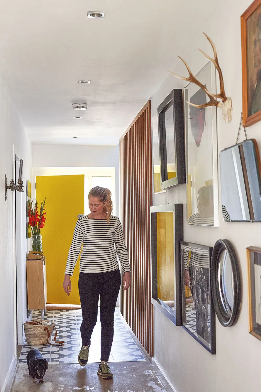
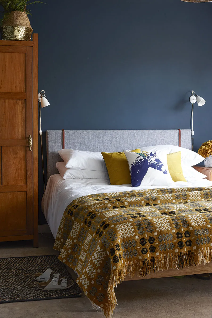
The couple are always on the lookout for interesting secondhand finds. ‘I tend to go for small impulse buys – jugs, mirrors, small shelves – as they can be fitted into the scheme easily. I love the way vintage pieces bring warmth and character to an otherwise simple space.’ When it comes to new buys, such as their bed, the generous sofa and the statement lighting, Kelly looks for designs that are in keeping with the overall mid-century-meets-industrial aesthetic. ‘I choose furniture and accessories with clean lines that won’t detract from our vintage treasures.’
Although barely recognisable from the house that the couple had originally visited back in 2011, the bungalow remains a work in progress, which is how they like it, says Kelly. ‘We make changes whenever we see something we particularly like. We’re creative souls, still tweaking, tinkering and coming up with new ideas for the house.’
More homes from Homes & Antiques
- A 17th-century home in Gloucestershire
- An eclectic bungalow in Wiltshire
- A coastal Georgian villa in Kent
Sign up to ourweekly newsletterto enjoy more H&A content delivered to your inbox.
