1
Cool & considered
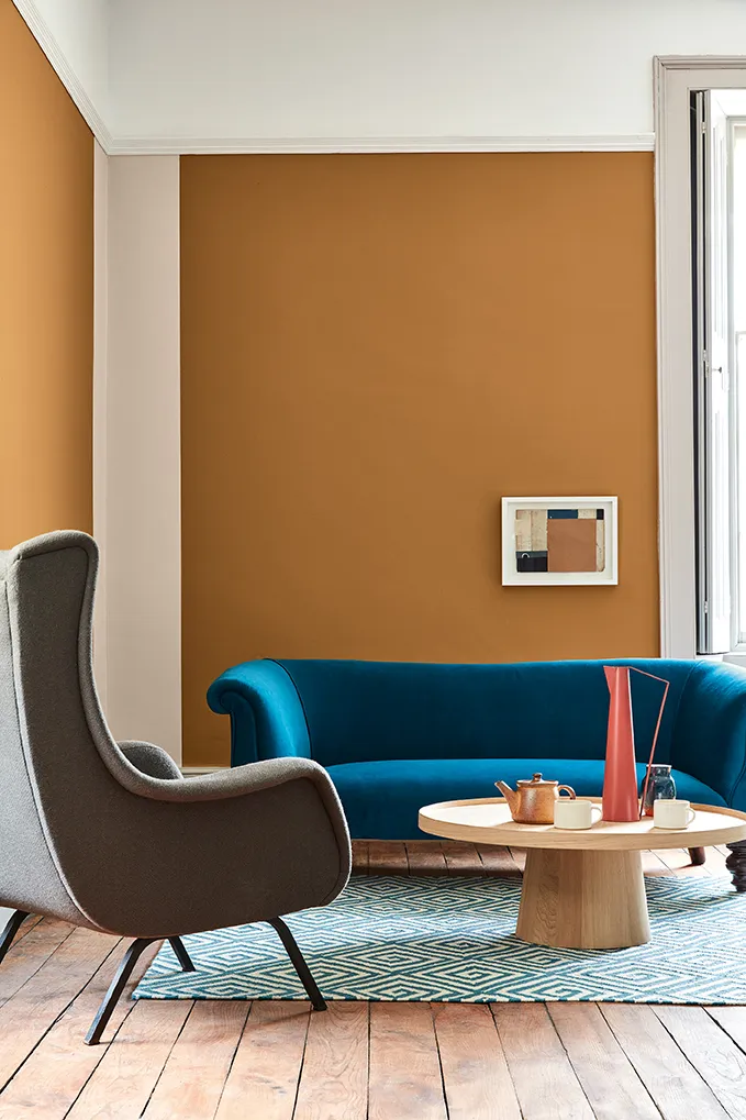
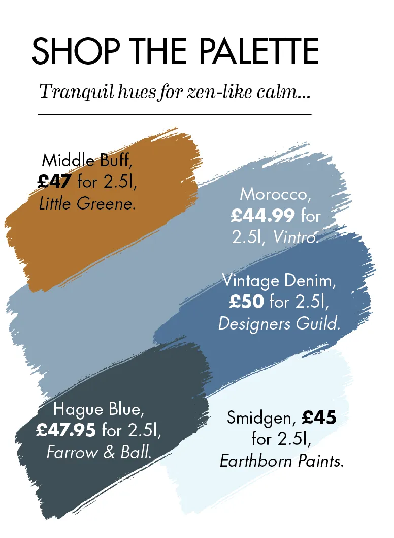
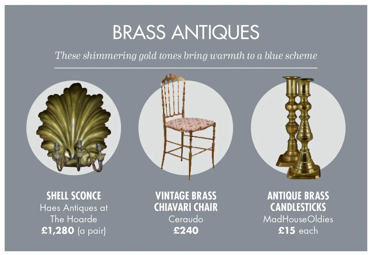
To create a sense of tranquillity in your home, look no further than the colour blue. From rich navy to peppy duck egg, try layering up a range of colours from the spectrum for a scheme that feels cohesive.
‘If you’re looking for ways to bring some calm, positivity and restfulness to your interior, there’s no better place to start than looking at blue and green palettes,’ explains Farrow & Ball Brand Ambassador Patrick O’Donnell. ‘They’re the colours of the outdoors – the sky, sea and fields – so remind us of our connection to nature.'
2
Spring awakening
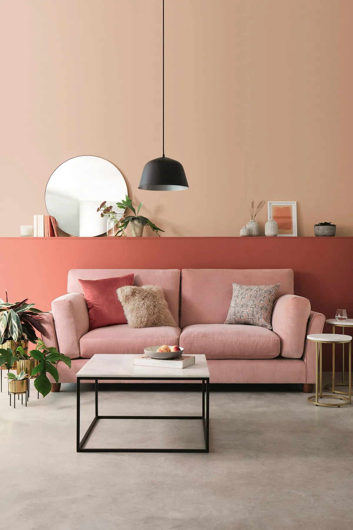
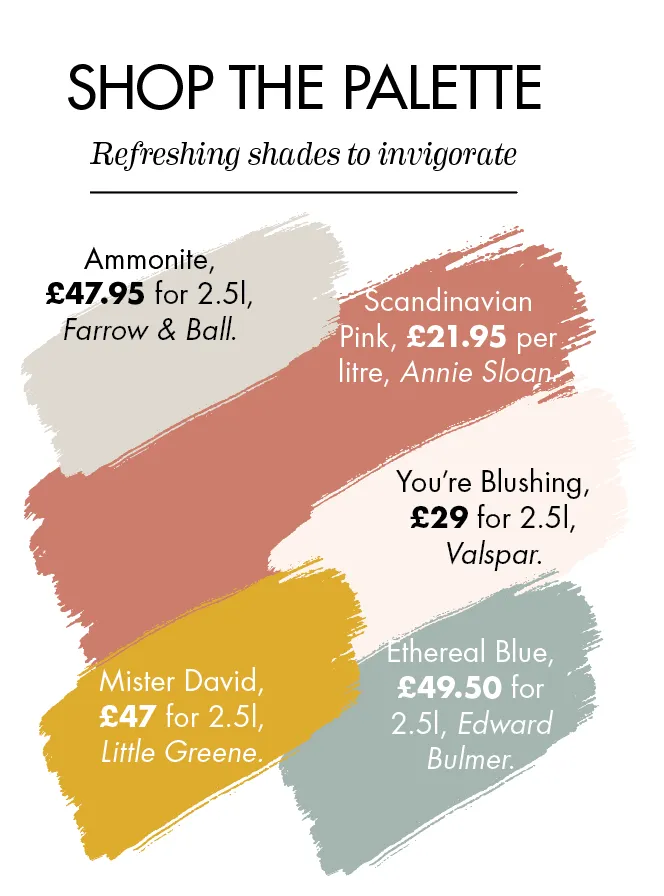
To give your home a gentle refresh, try replacing standard off-white or creamy shades with a barely-there pink to create a warm base for other ice-cream colours such as coral, yellow or powder blue. This palette will also enliven a dull room that has little natural light.
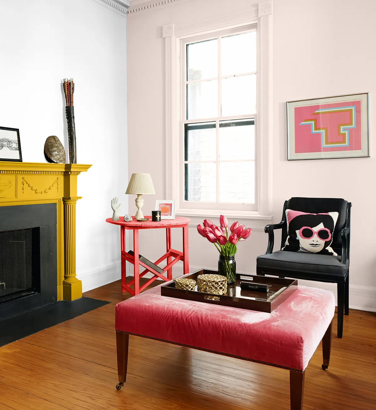
‘Colour trends have shifted from grey tones to a more restful and cosseting palette,’ Patrick says. ‘There is a particular demand for pinks, especially at the duskier end of the spectrum. We have also noticed a revival of yellow – a previously much-ignored shade.’
3
Earthly pleasures

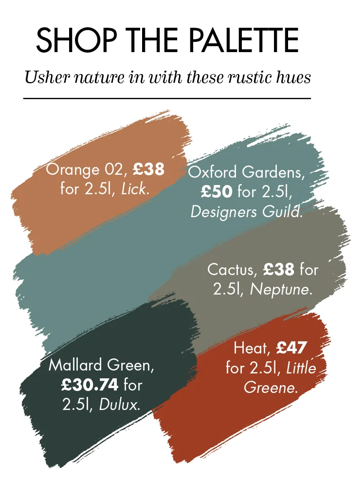
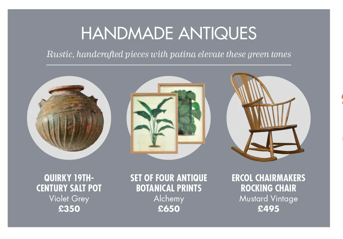
The colour of life, renewal and safety, green seems like the most logical tint to turn to in these turbulent times. Opt for cool-toned greens to create a classic look that’s perfect for period homes. Or incorporate pops of contrasting earthy shades – such as clay, ochre or brown – for a twist on tradition.
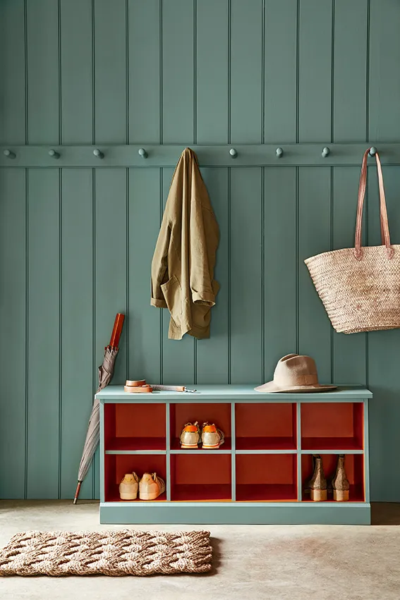
‘Reaching to nature for inspiration has made sure that a wide variety of greens are becoming a popular choice for home decor,’ says Crown Technical Consultant Judy Smith, ‘from rich and calming khaki shades, through to trendy neo-mint.’
4
The new neutrals
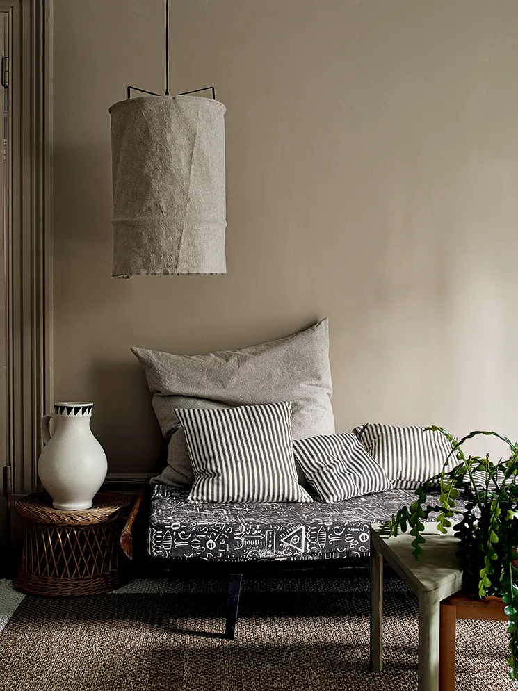
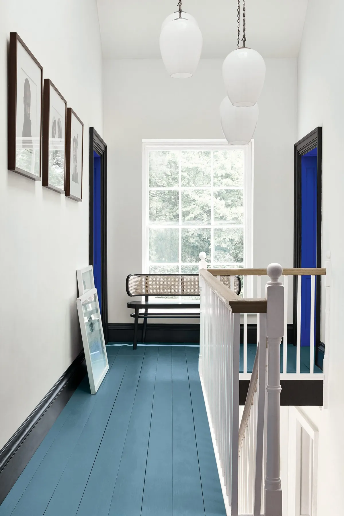
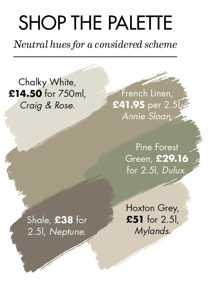
‘There are two things to consider when choosing colours,’ explains Judy from Crown. ‘What style do you want, and what is the atmosphere?’ To create an ambience that oozes informal Scandi charm, this neutral palette is simple and sophisticated. Use a chalky white hue as your base and build other colours around it.
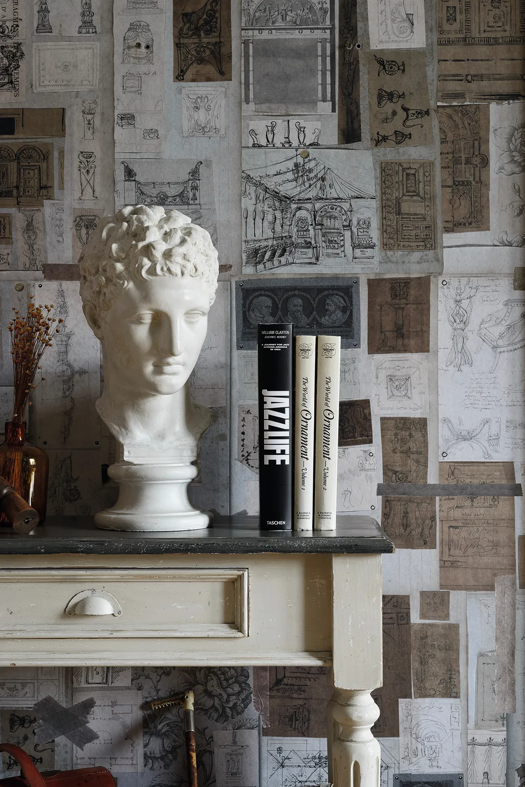
‘Once you’ve chosen your first colour, think about the other shades that could work well with it. If it’s a tonal look you want to recreate, stick to the same colour family, and perhaps include a brighter touch to bring the space to life.’
5
Pure positivity

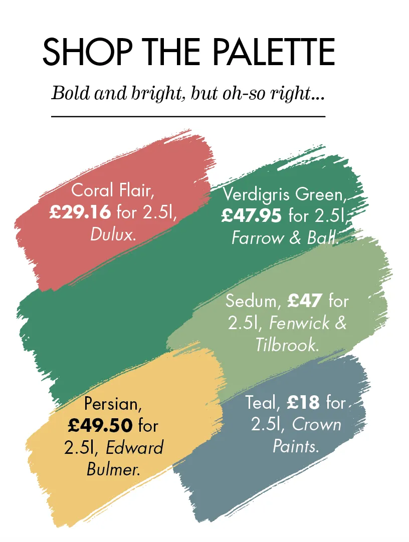
Now, let’s not forget the most important thing of all when it comes to colour – how it makes you feel. This palette of vivid green, fresh pink, yellow and teal is confident, upbeat and bang on trend – and ripe for experimenting, too. Fancy a blush pink ceiling? Go for it. Or yellow inside a cupboard door? Why not!
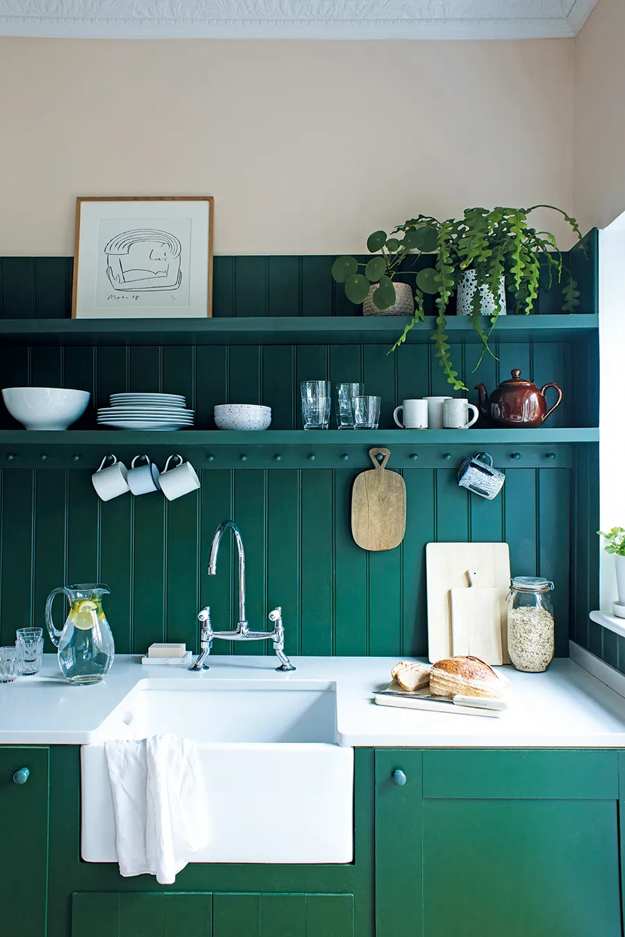
‘Thinking of how everything will sit together is really important, even more so now that wellbeing is at the front of our minds,’ explains Patrick. ‘Colour plays an important part in this story; it acts as the backdrop to every scene in our home.’
