Often tucked away in an awkward corner, your downstairs loo can be a difficult space to decorate. Usually small, dark and oddly shaped, they are often overlooked when it comes to interior decor.
But this doesn't need to be the case. There are plenty of ways to transform your dingy downstairs loo into a bright and welcoming space.
In fact, your cloakroom is the perfect place in which to experiment with more daring designs. If you've fallen in love with a maximalist wallpaper that feels too risky for your dining room or bedroom, try it out here – as you'll soon see, bold designs are perfectly suited to these small spaces.
Whether you're a maximalist wanting to go wild in the WC or a neutral minimalist creating a calming space, these cloakroom transformations are sure to inspire you...
14 Downstairs Toilet Ideas
Make a statement with wallpaper
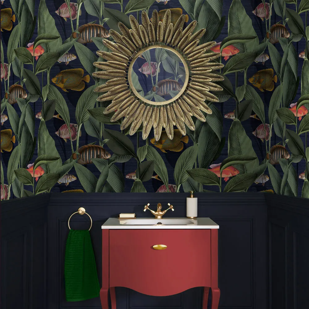
Usually, homeowners avoid using wallpaper in bathrooms due to the damp nature of the room - showers produce a lot of condensation that, without proper application, can cause wallpaper to either fall down or, worse, fall apart. But your downstairs toilet is the perfect place to make use of that maximalist wallpaper you've been dying to incorporate into your interiors, like this example from Graham & Brown.
Typically, the ground floor WC simply houses a loo and a sink, so you don't have to worry about extensive water damage. Often a smaller area, you can get away with covering every wall in a busy print without overwhelming the space. Why not even cover the ceiling too? There are no rules when it comes to interiors, especially in the loo!
To find a good wallpaper option for your downstairs loo, check out our guide to the best Farrow & Ball wallpapers available now.
Incorporate original features into your downstairs toilet design
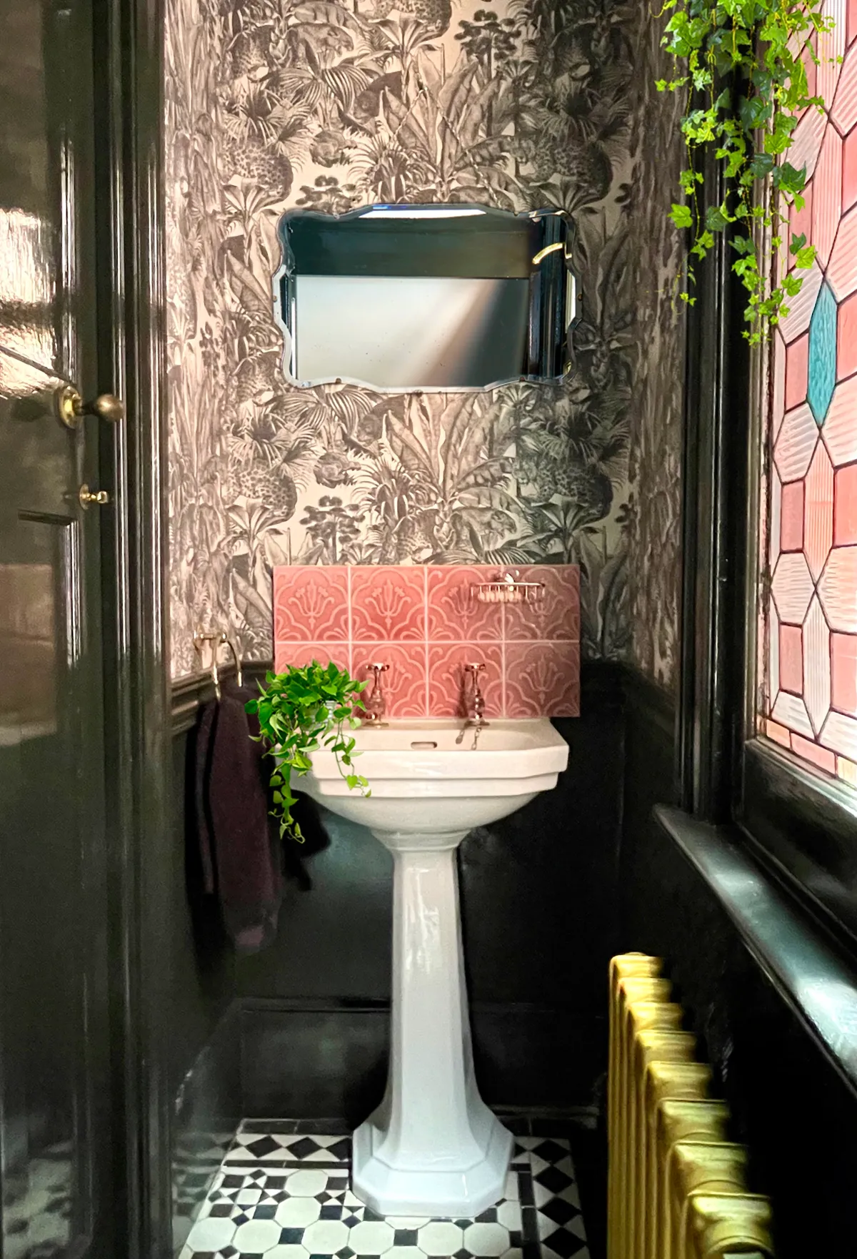
If you live in an older home with period details and quirky features, incorporating them into your downstairs bathroom design gives a really unique look. When Nina of @artdecojewel on Instagram transformed her cupboard under the stairs, she made a one-of-a-kind feature a focal point in the space.
'We knew we could make a feature of the original stained glass window' she says, explaining 'we teamed it with these glorious crackle-glaze pink tiles and then spent ages looking for colourful wallpaper, but when we saw the Faunacation wallpaper from Divine Savages it changed everything. I love the drama of the space, the magical light from the stained glass and the expressions on the big cats faces!'
Create a feature wall with colourful tiles
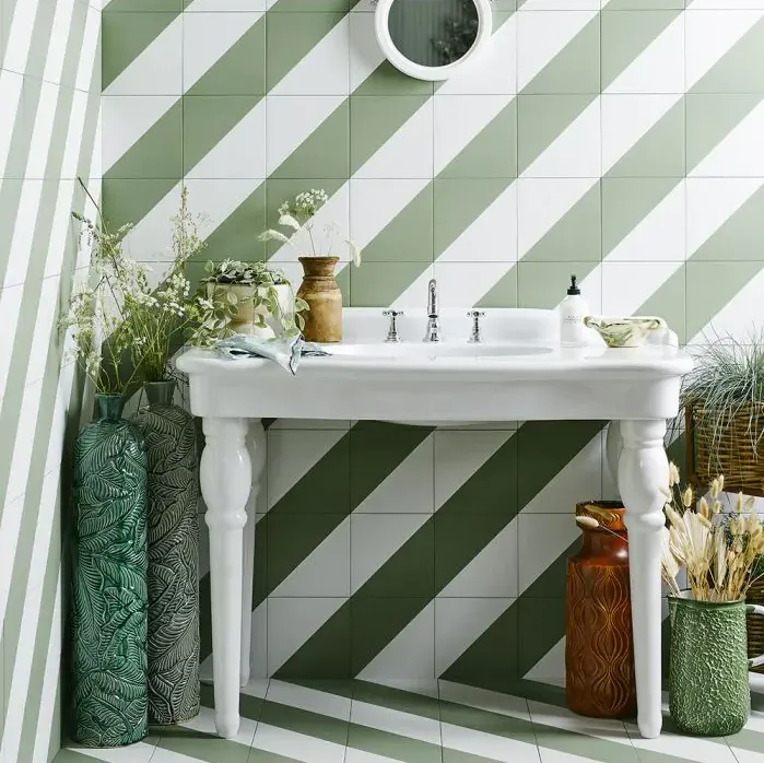
Tiles are an obvious choice when it comes to decorating your downstairs toilet, but an easy way to make it more interesting is to choose something with a fun colour or pattern.
These tiles by Bert & May are really rather simple; just half white, half green, but when they are applied to the wall they create a striking striped design.
Adding colour and pattern is an easy way to make a small space such as a cloakroom feel more interesting – perfect if you're trying to avoid a bland room that's struggling to find a sense of identity in your beautifully designed home.
You might also like feature wall ideas to make a stylish statement
Transform your WC into a maximalist haven
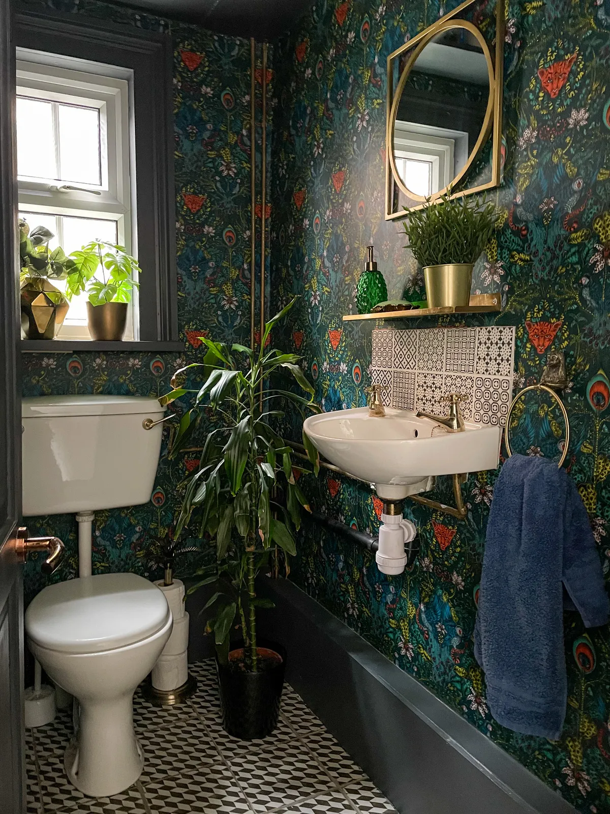
For a downstairs bathroom that has it all, why not combine a dark colour scheme, busy wallpaper, patterned tiles and luscious houseplants?
Leila of @zephs_house chose a gorgeous jungle-themed wallpaper which, paired with the black and white floor tiles and more decorative wall tiles, creates a cohesive space with more to discover the longer you admire it.
'We love the space because it has the wow factor and surprises new guests,' she explains, adding 'we chose to decorate it like this because the space is so small we could really go ‘wild’ without spending a fortune. It's my favourite room in the house.'
Create a smart layout with built-in units
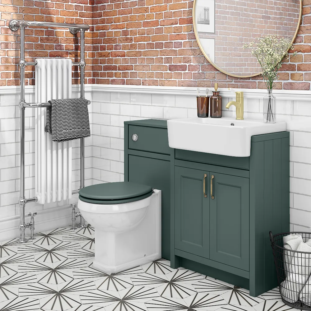
Going back to the fact downstairs toilets are often shorter on space than the average bathroom, you'll want to think about your choice of appliances. Built-in units are ideal, as they are tailored to perfectly fit your space. But why not take it one step further?
This example from Victoria Plumbing has a toilet and vanity combined in one unit, which not only saves on crucial floor space, but it actually makes the cloakroom look more tailored and put together. A win-win if you ask us!
Keep it traditional with wall panelling
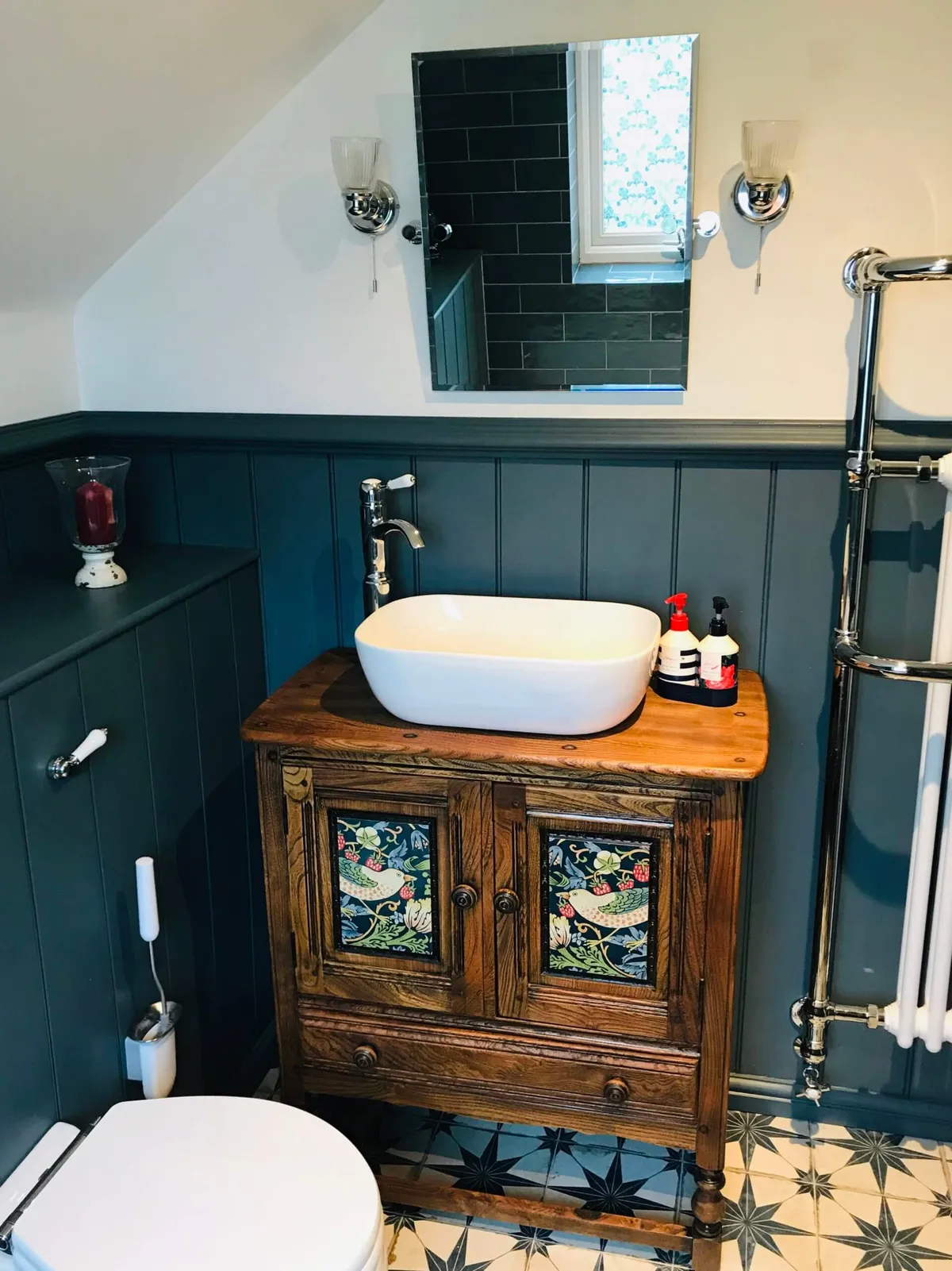
If you're more of a traditionalist, panelling is a great way to give your downstairs WC a fresh look. Tongue and groove panelling is particularly popular in spaces like the cloakroom as they look lovely, like this bathroom by The English Panelling Company, and are also easy to clean.
They are a great alternative to tiles as you skip the ongoing chore of trying to clean grout. These panels interlock with no gaps between them, producing a professional finish. Plus, if you want to switch up the colour after a couple of years, wood is much easier to add a lick of paint to!
You might also like stylish and practical bathroom ideas
Use mirrors to give the illusion of more space
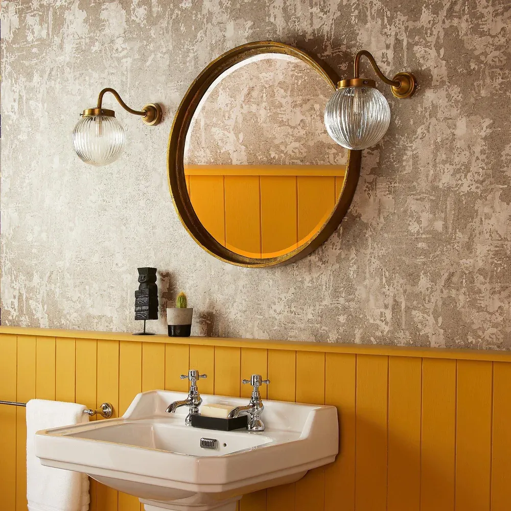
When designing your downstairs loo, make sure you add mirrors wherever you can. Aside from their obvious use, mirrors are great for making a space feel larger. Particularly effective in small, dark spaces, a mirror will help to bounce light to multiple surfaces, which is especially useful in a WC that might lack a natural light source.
And for downstairs loos that have the rare luxury of a window, a mirror will spread that daylight and make the room feel much brighter and more welcoming. This round wall mirror from Pooky is perfectly positioned between two wall lights, so what would have been a small section of the room benefitting from the lights has now become a beacon for every corner.
Embrace the darkness with a moody colour scheme
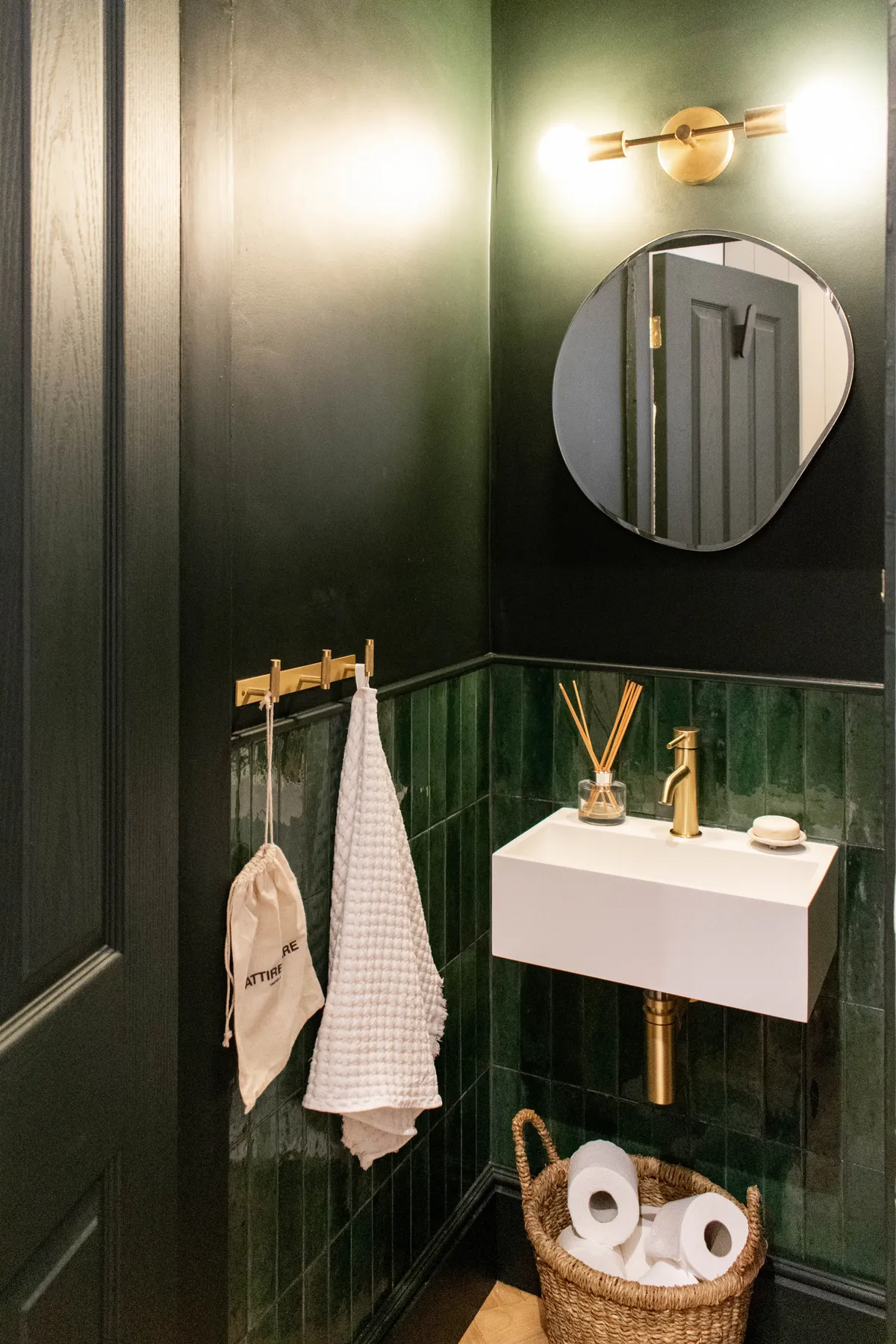
Sometimes, letting a dark space stay dark can look incredibly sophisticated. Your downstairs toilet is a great room to do this, which is exactly what Madelaine of @madelaineblogs on Instagram did. 'When we decided to turn our unused understairs cupboard into a downstairs toilet, I knew straightaway I wanted to embrace the fact it had no natural light and to go dark' she says.
'I'm so glad we did. It's one of my favourite rooms in the house, despite being the smallest, and is probably our most commented on by visitors. Who says small rooms can't pack a punch? The dark green walls, ceiling and woodwork, paired with brass finishes help to create a perfectly moody, sophisticated and dramatic feel. I absolutely love it.'
Save space with a dual toilet and basin
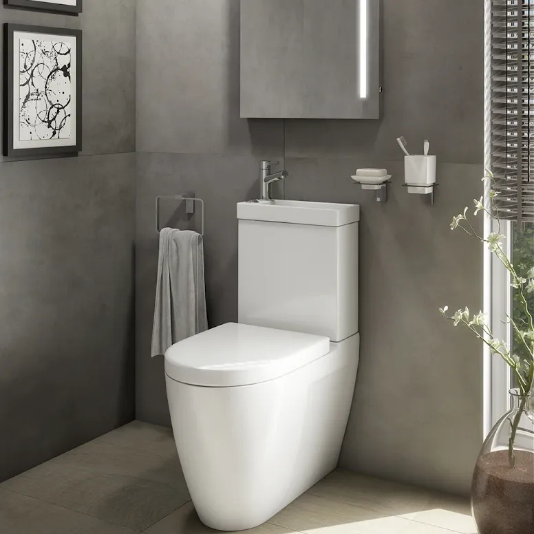
For a lot of properties, particularly those on the older side, the downstairs toilet would have been added at a much later date, which means it has probably been squeezed into a small corner or in the space under the stairs.
Adding a toilet with a built-in sink, like this one from Plumbworld, not only saves space, but it's also more water efficient, so you can give your WC a fresh look whilst helping to save the plant.
Be bold with a colour and pattern
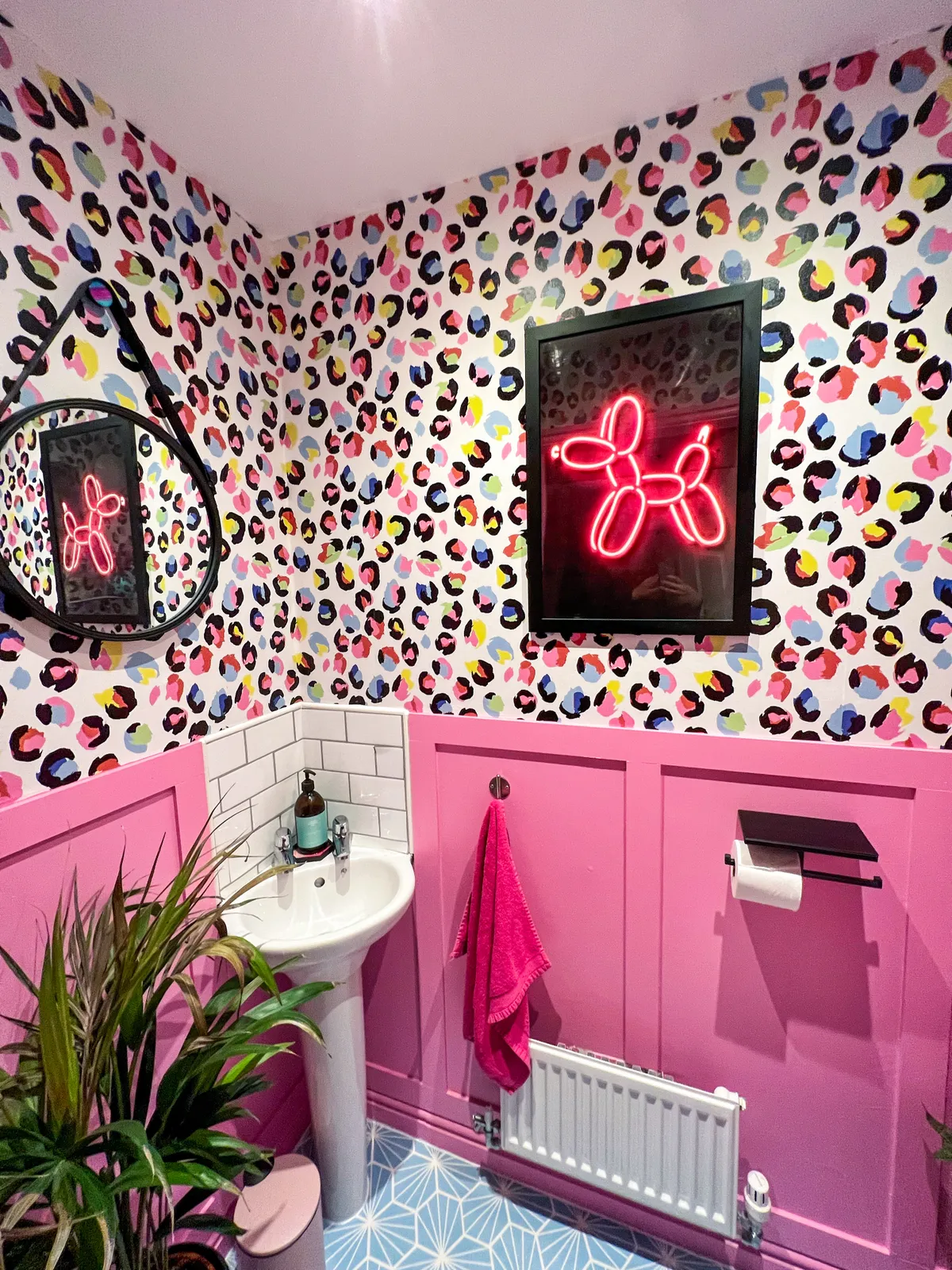
There's no reason you can't go all out with bright colours and busy patterns in your downstairs bathroom. Mel of @awholenewbuild on Instagram took the plunge in her cloakroom, mixing vivacious colours, printed wallpaper and patterned floor tiles, creating the cloakroom of a maximalist's dreams.
'Our downstairs WC is so tiny, I felt like I’d be able to get away with going a little crazy with pattern and colour in here - it always surprises visitors when they see it for the first time' says Mel.
'I had fallen in love with the wallpaper and colour-matched the paint for the panelling to the pink from the wallpaper. I also had the lino flooring colour matched to bring the different colours together. We love how fun and vibrant it is. It always makes me smile.'
You might also like how to mix and match pattern in your home
Have fun with floor tiles
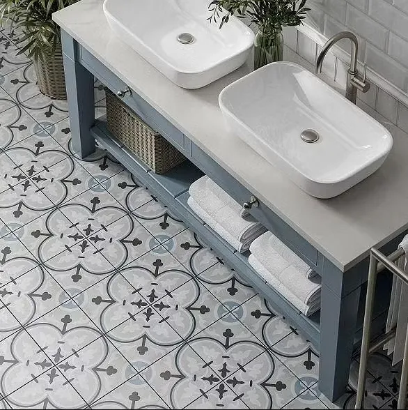
Busy walls and vibrant tones all over the room isn't to everyone's taste, so why not switch things up by creating interest with floor tiles? From reclaimed encaustic tiles to porcelain squares inspired by the past, you can find some truly beautiful options.
The beauty with floor tiles is there is so much variety - opt for a more neutral, patterned tile like these ones from Tile Giant, or create an eclectic mosaic with mismatched designs.
Create storage options with a freestanding vanity
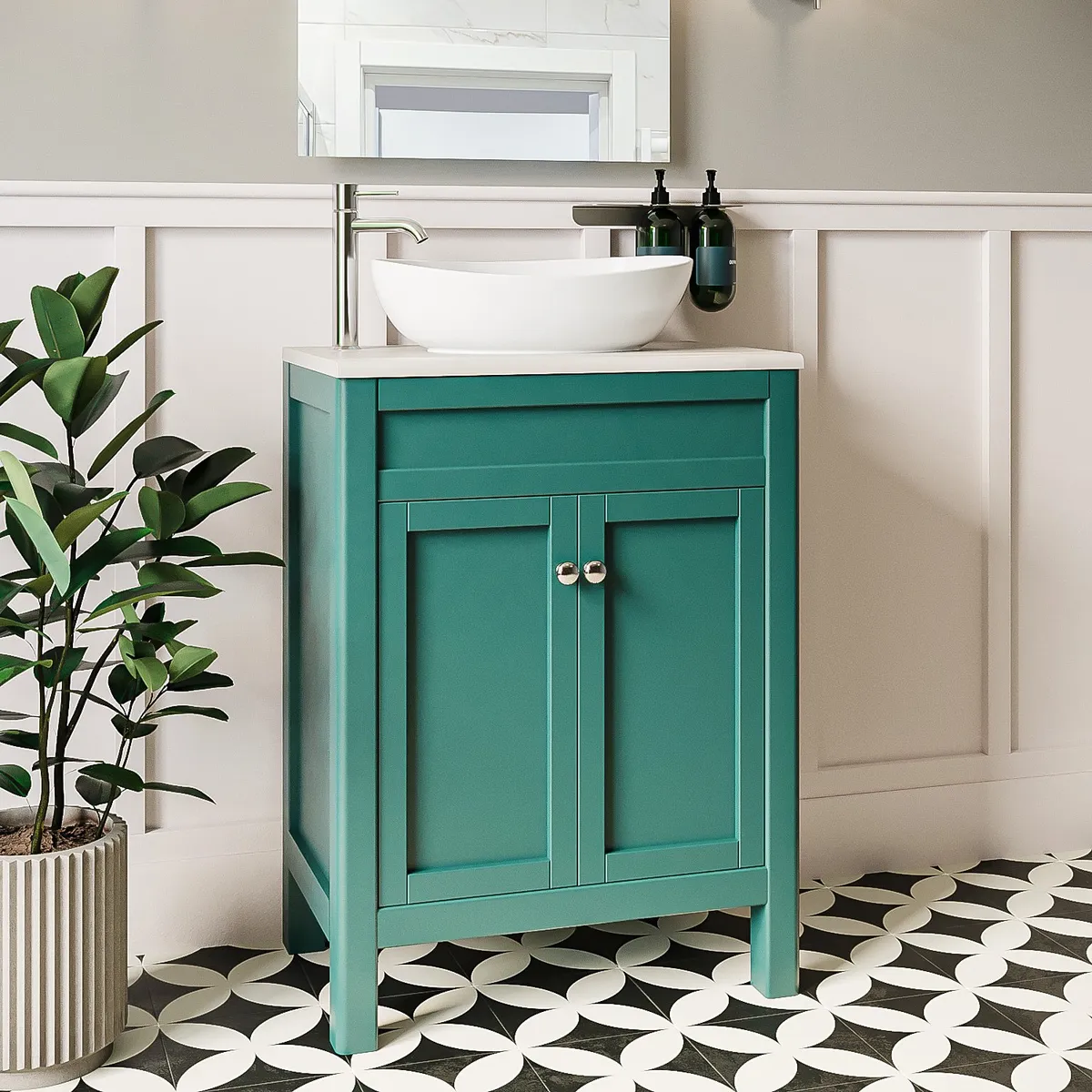
When you're tight on space, smart storage is everything. A freestanding vanity is usually a popular choice in a downstairs toilet, often looking refined and sophisticated in a small space.
The great thing about this style of bathroom storage is that you not only have the cupboard space, but also a perfectly usable gap between its base and the floor, so you can slide a couple of baskets holding your less used items that have nowhere else to live.
Draw the eye up with contrasting colours
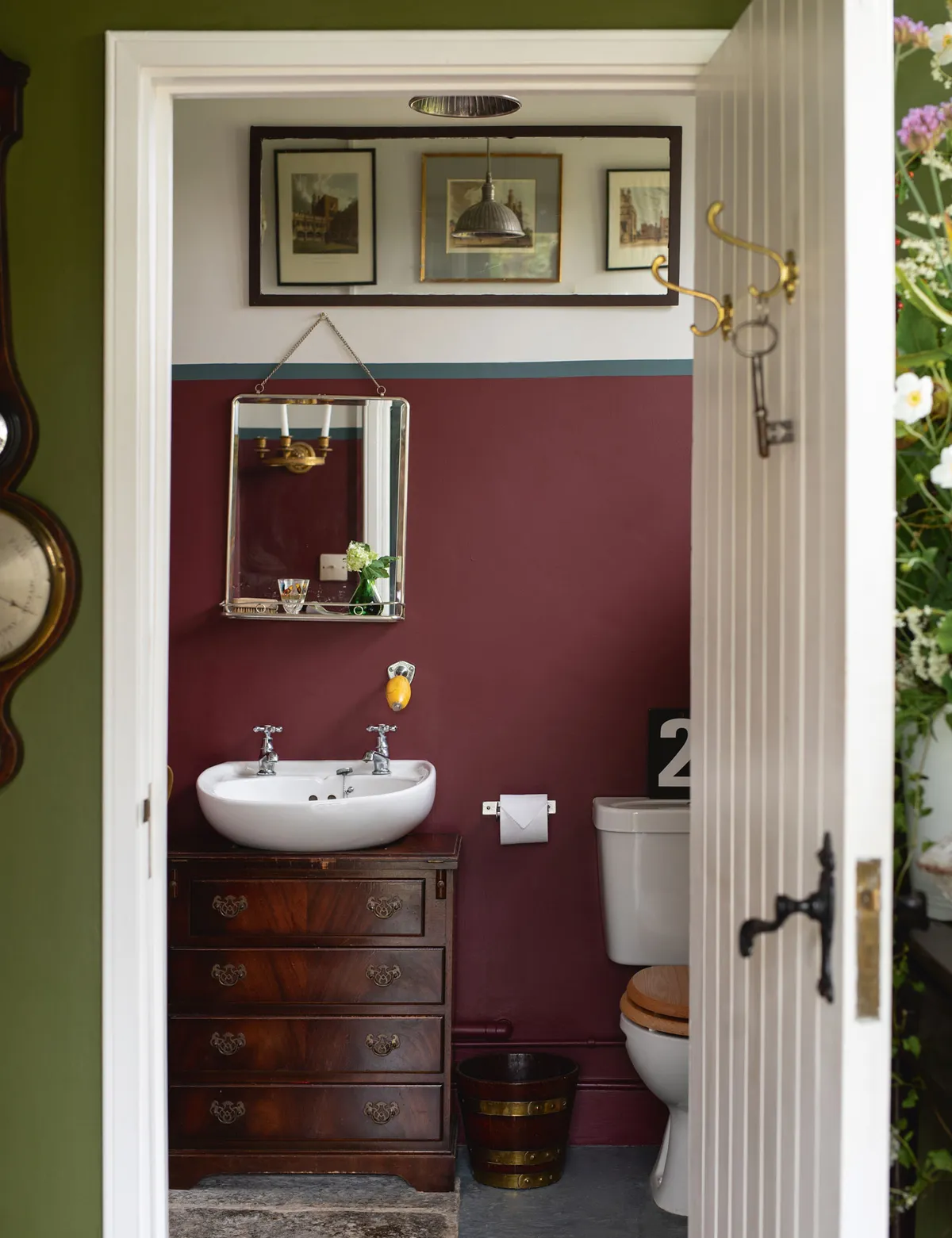
A trick as old as time, using contrasting paint colours is an easy way to elongate a space. Opt for a darker paint colour on three quarters of the wall, and top it off with a much lighter colour.
Not only will it make the room look taller, but your eye will naturally be drawn to the lighter paint colour. Go one step further by adding some artwork, like in this downstairs toilet created using Farrow & Ball paint colours.
Lean into the light with neutral tones
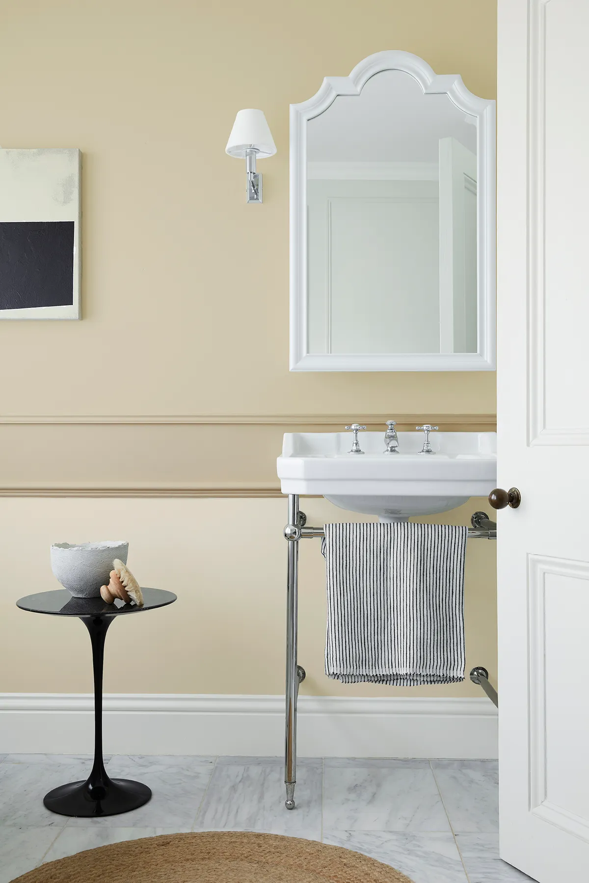
Light, airy neutrals are an easy and effective way to brighten a small space. Instead of opting for stark white tones in every corner, why not pair a few neutral tones to add some warmth to an otherwise cold space?
This bathroom by Little Greene combines three different shades of the same colour to add depth and interest to the walls. Find out the best Little Greene paint colours here.
On the lower part of the wall, Travertine Light, the palest of the colours has been used, and on the upper portion, Travertine Mid has been used, which makes the space feel cosy without the room feeling smaller.
On the dado rail, the darkest tone of the colour has been used, pulling all the shades together. This is a great way to add multiple colours into a space while keeping to a more minimalist palette.